[3] Penyajian Data (Diagram Garis)
Summary
TLDRThis video script provides a step-by-step guide on how to create line graphs using data from contingency tables and frequency distribution tables. It covers the process of plotting data points for both male and female categories, drawing the axes, labeling them, and connecting the points to form the line graph. Key tips include using dashed lines for accurate plotting and selecting appropriate scales for the y-axis. The guide emphasizes clarity in labeling and connecting points, offering useful techniques for making the graph both accurate and easy to understand.
Takeaways
- 😀 Line charts are used to present continuous or time-based data, such as population growth, agricultural output, or student numbers over time.
- 😀 The key concept in using line charts is to represent data that changes over a period, such as yearly population figures from 2002 to 2010.
- 😀 When constructing a line chart, the X-axis represents time or categories (e.g., years), and the Y-axis represents the frequency or value (e.g., population or student numbers).
- 😀 Properly labeling both axes and providing titles for the chart is essential to ensure clarity and comprehension of the data.
- 😀 For creating line charts from contingency tables, use two colors to represent different components (e.g., one color for women and another for men).
- 😀 When plotting data from a contingency table, make sure to place the points accurately on the chart, using dashed lines to guide correct placement before drawing the final line.
- 😀 It is helpful to use graph paper or a grid to accurately plot points on the line chart, especially when dealing with discrete data.
- 😀 When connecting points, ensure that the lines are smooth and accurately reflect the trend, avoiding confusion between different data series.
- 😀 The chart can represent various values, such as student scores across different ranges (e.g., 1-3, 4-6, 7-9), with frequency counts corresponding to each range.
- 😀 Adjust the scale on the Y-axis based on the data's range, such as using increments of 3 or 1, depending on the size of the data and the available space on the chart.
Q & A
What is the purpose of using a line diagram in data presentation?
-A line diagram is used to present continuous data, such as population numbers, agricultural yields, or student counts across consecutive years. It shows how data points change over time.
What kind of data is suitable for a line diagram?
-Line diagrams are suitable for continuous data, such as annual population numbers, agricultural production, or student attendance, where the data points represent sequential time intervals.
What does the X-axis represent in the line diagram discussed in the transcript?
-The X-axis in the line diagram represents categories or time intervals, such as years or specific numerical values from a data table.
What does the Y-axis represent in the line diagram?
-The Y-axis represents frequencies or the values being measured, such as the number of people or items in each category.
What is the first step in creating a line diagram from a contingency table?
-The first step is to create a title for the diagram, followed by labeling the X-axis and Y-axis with the appropriate categories and values from the contingency table.
Why is it important to label the axes in a line diagram?
-Labeling the axes is crucial for clarity, as it ensures viewers understand what the X-axis and Y-axis represent, making the diagram easier to interpret.
What should be done if there are two components, such as male and female, in a contingency table?
-When there are two components like male and female, different colors should be used for each group to visually differentiate them in the line diagram.
Why is it recommended to use a dashed line when drawing the diagram?
-Using a dashed line helps to correctly align the points on the diagram, ensuring accuracy in plotting data and identifying intersections of data points.
What mistake did the presenter acknowledge while creating the line diagram?
-The presenter acknowledged the mistake of not drawing dashed lines first to help with accurate point placement, which would have made it easier to align the points on the diagram.
How should the points on the line diagram be connected after being plotted?
-After plotting the points, they should be connected with a continuous line to visually represent the trend or pattern of the data.
What is the process of creating a line diagram from a frequency distribution table?
-The process includes writing a title, labeling the axes, plotting the points based on the frequency values, and then connecting the points to create the line diagram. The intervals on the Y-axis and X-axis must be chosen appropriately based on the data.
Outlines

このセクションは有料ユーザー限定です。 アクセスするには、アップグレードをお願いします。
今すぐアップグレードMindmap

このセクションは有料ユーザー限定です。 アクセスするには、アップグレードをお願いします。
今すぐアップグレードKeywords

このセクションは有料ユーザー限定です。 アクセスするには、アップグレードをお願いします。
今すぐアップグレードHighlights

このセクションは有料ユーザー限定です。 アクセスするには、アップグレードをお願いします。
今すぐアップグレードTranscripts

このセクションは有料ユーザー限定です。 アクセスするには、アップグレードをお願いします。
今すぐアップグレード関連動画をさらに表示
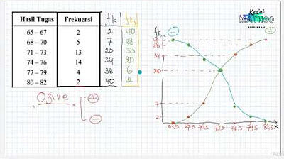
Statistika Deskriptif (Bag 1): Cara Membuat dan Membaca OGIVE

TABEL DISTRIBUSI FREKUENSI KUMULATIF DAN RELATIF

Mengubah data tunggal menjadi data berkelompok dengan MS Excel

FREQUENCY DISTRIBUTION: Common Terminologies Vid#4 FREE Tutorial | Statistics | EASILY EXPLAINED!

PENYAJIAN DATA || TABEL DIAGRAM GRAFIK (PART 1)
Statistika - Penyajian Data Eps.2 l Ruang Belajar #StudyWithDiida
5.0 / 5 (0 votes)
