Data Collection and Presentation | Statistics
Summary
TLDRThis video delves into the crucial aspects of data collection and presentation in statistics. It distinguishes between primary and secondary data, detailing methods like direct experiments, interviews, surveys, and observations for gathering primary data. The script also emphasizes the importance of proper citation when using secondary data. For data presentation, it outlines textual, tabular, and graphical methods, including frequency distribution tables and various graphs like histograms, bar graphs, line graphs, and pie charts, to effectively communicate data insights.
Takeaways
- 🔍 Data collection is essential for statistics and involves gathering primary (first-hand) and secondary (existing) data.
- 🧪 Primary data collection methods include direct experiments, interviews, surveys, observations, and registrations.
- 📊 Tools for data collection can range from experiment logs and interview guides to attendance sheets.
- 📚 Secondary data is borrowed from other researchers and requires proper citation to credit the original source.
- ✍️ Data presentation involves transforming raw data into formats that are understandable and accessible to an audience.
- 📝 Textual presentation of data involves using narrative and paragraphs to describe the data.
- 📋 Tabular presentation, such as frequency distribution tables (FDT), organizes data into classes and frequencies for easy analysis.
- 📊 Graphical methods like histograms, bar graphs, line graphs, and pie charts provide visual representations of data for quick understanding.
- 📈 Histograms are used for quantitative data and show continuous data flow without gaps between bars.
- 📊 Bar graphs are suitable for categorical data, allowing gaps between bars to represent different categories.
- 📈 Line graphs, also known as time series, depict data trends over time, highlighting patterns and the steepness of data changes.
- 🍕 Pie charts illustrate the proportion of components that make up a whole, useful for showing parts of a total like sales or budget allocations.
Q & A
What are the two main types of data discussed in the video?
-The two main types of data discussed in the video are primary data and secondary data. Primary data refers to data collected by the researchers themselves, while secondary data comes from other researchers, which may include published or unpublished materials.
What is an example of a tool used for collecting primary data through direct experiment?
-An example of a tool used for collecting primary data through direct experiment is an experiment log or observation log, which is used to record observations and results during the experiment.
How is an interview guide defined in the context of the video?
-An interview guide, as defined in the video, is an outline of the topics to be discussed with an interviewee. It may contain questions or simple topics that serve as the flow of the interview.
What is the purpose of a survey in data collection?
-A survey is used for collecting primary data through self-administered questionnaires, which can be in the form of checklists or rating scales distributed to respondents to gather their perceptions or data.
Can you explain the process of creating a frequency distribution table (FDT) for qualitative data?
-To create an FDT for qualitative data, list the different categories or responses in the first column as row headers, and then count the frequency or number of occurrences for each category, placing these counts in the corresponding row.
What are the common parts of a statistical table?
-The common parts of a statistical table include the table number and title, column headers, row headers, and the body, which is the intersection of rows and columns containing the data.
How does a histogram differ from a bar graph in terms of data representation?
-A histogram represents quantitative data and does not have gaps between the rectangles, showing a continuous flow of data. In contrast, a bar graph represents categorical or qualitative data and allows gaps between the bars, as these represent different categories.
What is the significance of the slope in a line graph?
-The slope of a line graph indicates the rate of change in the data over time. A steep slope signifies a rapid increase or decrease, while a gentle slope indicates a slower change.
Why is a pie graph used for data presentation?
-A pie graph is used to show how different components make up a whole. It is effective for displaying data that can be divided into subparts, such as the allocation of resources or the composition of sales.
What are the three main methods of data presentation mentioned in the video?
-The three main methods of data presentation mentioned in the video are textual, tabular, and graphical methods. Textual is used for narratives, tabular for key points, and graphical for audience-friendly visual representations.
Outlines
📊 Introduction to Data Collection and Presentation
This paragraph introduces the topic of data collection and presentation, emphasizing the importance of data in statistics. It distinguishes between primary and secondary data, explaining that primary data is collected by the researcher, while secondary data is sourced from other researchers' work. Various methods and tools for collecting primary data are outlined, including direct experiments, interviews, surveys, observations, and registration. The paragraph also touches on the necessity of presenting raw data in a way that is understandable to the audience, hinting at different presentation formats to be discussed later.
📈 Presenting Data: Textual and Tabular Formats
The second paragraph delves into the presentation of data, starting with textual presentation where data is narrated through paragraphs and narrations. It provides an example of how to present data from a class test, detailing the scores and performance of students. The paragraph then transitions to tabular presentation, focusing on frequency distribution tables (FDT). It explains the structure of statistical tables, including table number, title, column headers, row headers, and the body containing the data. An example is given for creating a qualitative FDT for students' comfort food preferences, illustrating how to list categories, count frequencies, and calculate totals.
📊 Graphical Data Presentation: Histograms and Bar Graphs
This paragraph explores graphical methods of data presentation, beginning with histograms derived from quantitative frequency distribution tables. It describes the process of creating a histogram using age distribution data, emphasizing the need for continuous flow and no gaps between rectangles. The paragraph then contrasts histograms with bar graphs, which are used for categorical data and allow gaps between bars. It discusses the orientation of bar graphs, whether vertical or horizontal, and how they differ in axis representation. The paragraph also provides guidelines for interpreting histograms and bar graphs, such as looking for continuous data flow and the absence of gaps in histograms.
📉 Advanced Graphical Presentations: Line Graphs and Pie Charts
The final paragraph covers additional graphical data presentation methods, including line graphs and pie charts. It explains that line graphs, similar to histograms, do not touch the zero point on the y-axis and are used to display trends over time. The paragraph advises looking for patterns and noting the slope of the line to understand data behavior. Pie charts are introduced as a way to show how components make up a whole, with examples given for student allowance allocation and business sales components. The paragraph concludes by summarizing the different data presentation methods, highlighting the importance of choosing the right method to make data easily understandable for the audience.
Mindmap
Keywords
💡Data Collection
💡Primary Data
💡Secondary Data
💡Data Presentation
💡Textual Presentation
💡Tabular Presentation
💡Graphical Presentation
💡Histogram
💡Bar Graph
💡Line Graph
💡Pie Chart
Highlights
Introduction to data collection and presentation in statistics.
Explanation of primary data as data collected by the researchers themselves.
Definition of secondary data as data obtained from other researchers' work.
Direct experiment as a method for collecting primary data with tools like experiment logs.
Interview as a method for primary data collection, using an interview guide as a tool.
Surveys as a self-administered method for collecting primary data through questionnaires.
Observation as a method for collecting primary data using checklists.
Registration as a simple method for collecting primary data, such as attendance sheets.
The necessity of proper citation when using secondary data from other researchers.
Raw data requires presentation methods to be understandable to an audience.
Textual presentation of data through narratives and descriptions.
Tabular presentation as a method for organizing data in tables with classes and frequencies.
Frequency Distribution Table (FDT) as a tool for organizing raw data.
Components of a statistical table including table number, title, column header, row header, and body.
Creating a qualitative FDT by listing categories and counting frequencies.
Quantitative data requires a different approach for constructing FDT, with a separate video provided for details.
Graphical methods as a visual way to present data for quick understanding.
Histogram as a graphical representation of quantitative data from FDT.
Bar graph as a graphical representation for categorical data with gaps between bars.
Line graph for showing trends over time with attention to patterns and slopes.
Pie graph as a way to represent parts of a whole, suitable for data that can be divided into subparts.
Summary of data presentation methods: textual, tabular, and graphical for different audience needs.
Transcripts
hello everyone in this video let us talk
about data collection and presentation
without further ado let's get this
lesson started
[Music]
data collection methods and tools of
course when we are talking about
statistics we are all dealing with data
data set the numbers that needs to be
interpreted
we cannot interpret something that we
have not yet collected so the following
are the different data and the methods
and tools on how we can collect them
when we talk about primary data based on
the previous video that i have presented
primary data refers to the data that the
researchers collected themselves these
are authentic first-hand data
and on the other hand we have secondary
data these are data that came from other
researchers
it may be from published or unpublished
materials
when we are dealing with primary data
the following are the methods and the
tools that we can use to collect them
first is by direct experiment say for
example we have different set up
in laboratories or in classroom
and we are observing and taking down
notes of the different results or
behavior of the things that we are
experimenting so what we can use as a
tool in experiment are the experiment
blogs or observation logs
another method of collecting primary
data is through interview it can be over
the phone or
through video conferencing or
face-to-face interview
and a tool can be the interview guide
when we say interview guide it is an
outline of the topic that you will be
discussing with your interviewee it may
contain questions or just simple topics
that will be the flow of the interview
next we have survey this is more of the
self-administered questionnaires
it can be in a form of checklist or
rating scales which you will distribute
to your respondents to get their
perception or to get data from them
observation say for example you are
seated
and
immersed in a certain setting and you
want to observe how the different
people interact with each other so you
can provide a checklist
and you will just put a check on the
things that you have noticed
and the most simple
way of
collecting primary data is through
registration for example you just want
to know how many students attended the
synchronous class so you can generate an
attendance sheet or a registration sheet
at the end or before the activity or
before the class
next secondary date as i mentioned a
while ago these are the data that
the other researchers
collected so when you are going to
borrow these data you have to
search no published and unpublished
materials
and you have to observe proper citation
to give credit to the original owner of
the data
data gathered are raw data they are not
yet ready to be presented to the
audience so you have to be familiar with
the different ways of presenting data
first and i think the very simple is the
textual presentation
from the word itself text while it is
presenting the data using paragraphs
narration
you are narrating the data gathered from
the respondents or the participants so
for example here in a class of 40
students five of them obtained the
perfect score of 50 in their third
quarter long test in statistics 18
students got a score of at least 40
while two students scored 19 and below
generally the students performed well in
the test with 30 or 75 of them obtaining
a passing score of at least 38 so that
is one good way to present the data
there are also other ways like tabular
form
from the word itself table or frequency
distribution table fdt
when we talk about fdt this is
organizing raw data in table using
different classes and frequencies when
we say classes it can be
qualitative or categorical
like
city or country where a person lives and
when we say frequency it is the number
of data
that is corresponding to a certain class
the count of the data
corresponding to the certain class
so the following are the common parts of
statistical tables
first part is the table number and title
when we say title it is a short phrase
that describes what the table is all
about and this part is found above the
table
column header it
talks about the label of each column
what does each column represent
row header is the label per row what is
that row referring to
and of course the body the body itself
is the intersection of a certain row and
a certain column that contains the data
we have different fdt depending upon the
nature of the data when we have a
categorical or nominal or qualitative
data something like this now 10 students
were asked regarding their comfort food
and the data below are their answers
we are tasked to find the frequency
distribution for the data so what we can
do to
create the fdt for this is we will just
list down the different comfort food
that will take up the first column
this is the column header for the first
column comfort food and the entries on
the first column will serve as the row
header
so we just list down all the possible
answers
and for the frequency we just count how
many students answered that comfort food
so for ice cream we have four that's why
we have four here
french fries we have two donuts we have
one and milk tea we have three so at the
end of the table of course we put the
total 10 students
and as you may notice the table also
contains the number in the title which
is found above it
that is how a qualitative or categorical
or nominal frequency distribution table
looks like
of course we know that aside from
qualitative data we also have
quantitative
data so in order to construct the fdt of
quantitative data i have made a separate
video and you can access it here in the
upper right corner you just click on
this link
i made a separate video about that
because it has certain steps that you
need to follow
the third
method of presenting data is the
graphical method when we talk about
graphs these are visual representations
that helps the audience or the viewers
understand the data at a single glance
so at first look they can get overview
of the data is the data increasing or
decreasing over time is the data
divided into different subparts those
are the important key points that the
data set may have and can be highlighted
by graphical representation
first we have the histogram histogram is
generated from
quantitative frequency distribution
table the one that has different class
boundaries so for example let's have an
excerpt of that fdt quantitative ftt let
us just take the columns that we need
which are the class boundaries and the
frequency let's make a histogram for
this
so this is actually the distribution for
the viewers ages
so you may notice we prepare
this blank
graph
for the y-axis we have the frequencies
and for the x-axis we have the
boundaries
we just write here the possible values
found in the class boundaries
first
is 19.5 to 29.5 that is 8
so we can draw a rectangle from 19.5
until 29.5 and its height should be 8
because that corresponds to the
frequency of that class for the next
class which is 29.5
until
39.5 its frequency is 9 that's why its
height should be 9.
for the next class 39.5 until 49.5
its frequency is 6 that's why its height
is until
6.
and finally we have 2
as the frequency or the height for 49.5
to 59.5
so the following are the things that you
have to take note when dealing with
histogram
first the histogram does not touch zero
the
leftmost part or leftmost line of the
histogram should not touch the
frequencies or the y-axis because it
will always start with
the lower class bounded here
second the histogram shows a continuous
flow of data or in other words there are
no gaps between the rectangles again let
me repeat that for histogram there
should be no gaps between the rectangles
because as you can see on the class
boundaries the data is also continuous
the first class ends with 29.5
and the second class starts with 29.5
so it seems like the ending point of the
first class
is the starting point of the next one
so that is for the histogram it's quite
similar to bar graph however bar graph
is dealing with categorical or
qualitative ftt
unlike in the histogram it deals with
quantitative fdt
since bar graph is derived from
qualitative or categorical fdt as you
may notice we have here the bars that
has gaps between them
yes bar graph allows gaps between the
rectangles because these are not
continuous data
different
bars refers to different categories
bar graph can either be
vertically oriented like this one
frequency of comfort food
it can also be horizontally oriented
just like the bar graph on the right the
first quarter sales by sales person in
us dollars
depending upon what is more appropriate
with the data set you can either use the
horizontal or the vertical bar graph
of course when we are dealing with
vertical bar graph the y-axis are the
frequencies
and the x-axis are the different
categories
the access will be switched
if we are dealing with a horizontal bar
graph
the y-axis will now be the categories
and
the x-axis will now be the sales or the
frequency
another type of graphical data
presentation is line graph or time
series
just like histogram line graph does not
touch any number on the y-axis or the
zero part because it starts with the
first entry which is the year
also line graph talks about the trend of
data over time how the different values
behave over time when you are presented
with a time series or line graph
the following are the things that you
have to look
first
look for trends or pattern
is the line decreasing or increasing
well of course it has something to do
with the behavior of the data if the
line is decreasing meaning the data is
also decreasing
or if the line is rising to the right
then the data is also increasing
another thing that you have to take note
is the slope of the line or the
steepness of the line
a steep slope
talks about a rapid decrease or increase
of the data set
just like what you can see in this line
graph or time series
from 2016 to 2017 it's decreasing but
not that rapid because the slope is not
that steep
there was
a rapid decrease
from 2017 to 2018
then it again increased from 2018 to
2019 and there was also a sudden drop
of enrollees from 2019 to 2020
so again for line graph or time series
look for pattern and take note of the
slope of the line
finally we have pie graph pie graph
talks about the components and how they
make up the whole like what we can see
in this pie graph
so 30
of the students shows milk tea as the
comfort food 40 chose ice cream
uh 20 chose french fries and 10
shows donut so always remember that pie
graph is used if the data can be divided
into different subparts for example the
allocation of allowance of a certain
student
how much does he allocate for food how
much
does he allocate for
mobile plan
for transportation
another pie graph can be about the
components of sales of a certain
business
how much of the sales came from a
certain business how much came from
investment and so on
so those are the different ways on how
we can present data
we have textual which is used more for
narratives
we have tabular if we need to look at
key points
that needs to be reported as well and
third presentation is the graphical
method which is more audience friendly
because
the viewers can understand the data at a
single glance
[Music]
Weitere ähnliche Videos ansehen
Research Design: Choosing your Data Collection Methods | Scribbr 🎓
Data Collection and Analysis Procedure
Pendahuluan Metode Penelitian Part I
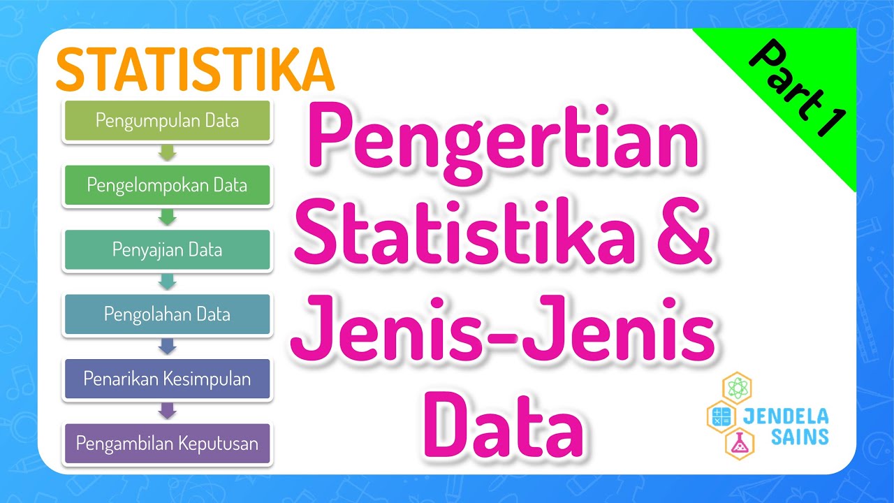
How to Create Charts and Graphs with AI in Seconds! | Best AI Tool
Types of Data: Nominal, Ordinal, Interval/Ratio - Statistics Help
A Beginner's Guide to Graphing Data
5.0 / 5 (0 votes)