Hans Rosling's 200 Countries, 200 Years, 4 Minutes - The Joy of Stats - BBC Four
Summary
TLDRThis script narrates a 200-year journey of global health and wealth, illustrating the convergence of nations through animated data. Starting from the poor and sick state in 1810, it shows the Industrial Revolution's impact, the setbacks of wars and epidemics, and the eventual rise of emerging economies. Despite current disparities, the script highlights remarkable progress and a hopeful future where aid, trade, and green technology may lead all to prosperity and health.
Takeaways
- 📊 Visualization is crucial for understanding complex data, especially in the field of global health.
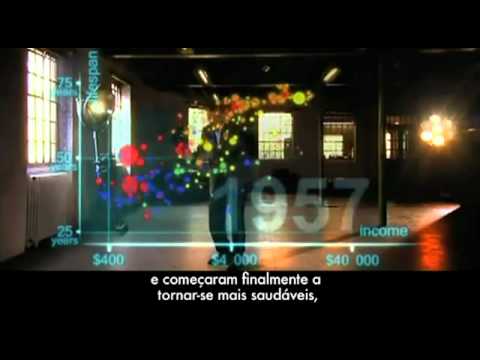
- 🌐 The presenter introduces a unique method of data animation in real space to depict historical trends.
- 📉 In 1810, all countries were depicted as poor and sick with life expectancies below 40, highlighting the global health and wealth status at the time.
- 🇬🇧 The UK and the Netherlands were slightly ahead of other countries in terms of health and wealth during the early 19th century.
- 🏭 The Industrial Revolution led to a divergence in health and wealth between Western countries and their colonies.
- 😷 The script mentions significant historical events like the First World War and the Spanish flu, illustrating their impact on global health.
- 📈 Despite the Great Depression, Western countries continued to progress towards greater wealth and health, while other regions lagged.
- 🎉 The year 1948 is highlighted as a significant year for the presenter, with the end of World War II and the beginning of global health improvements.
- 🌍 Post-WWII, the script describes the widening gap between countries, with the US and Japan leading while others like Brazil and Iran struggled.
- 🚀 The script shows the rise of former colonies gaining independence and subsequently improving in health and wealth.
- 🌱 The 1970s are marked by the rise of emerging economies in Asia and Latin America, beginning to close the gap with Western countries.
- 🏥 The presenter emphasizes the current state of the world, noting the middle ground most people live in, yet acknowledges vast disparities both between and within countries.
- 🔍 By breaking down country averages into regional data, the presenter illustrates the internal inequalities within large countries like China.
- 🌟 The script concludes on a hopeful note, envisioning a future where aid, trade, green technology, and peace can lead to a healthier and wealthier world for all.
Q & A
What is the main focus of the speaker's work?
-The speaker focuses on global health and emphasizes the importance of visualizing data to make it enjoyable and understandable for people.
What is the speaker attempting for the first time in their presentation?
-The speaker is attempting to animate data in real space with the help of technical assistance.
What are the two axes used to represent data in the visualization?
-The two axes represent health life expectancy from 25 to 75 years and wealth, measured by income per person from $400 to $40,000.
How does the speaker describe the global situation in 1810?
-In 1810, all countries were depicted as being sick and poor with life expectancies below 40, with only the UK and the Netherlands being slightly better off.
What major event is shown to have a significant impact on the world's health and wealth?
-The First World War and the Spanish flu epidemic are shown to have a significant negative impact on the world's health and wealth.
How does the speaker describe the progress of Western countries during the 1920s and 1930s?
-Despite the Great Depression, Western countries continued to forge on towards greater wealth and health.
What significant event is highlighted in 1948?
-1948 is highlighted as the year the speaker was born, and it is also noted for the end of the Second World War and the Winter Olympics in Sweden.
What changes are observed in the world after the Second World War?
-After the Second World War, the differences between countries were wider than ever, with the United States leading and countries like Japan catching up, while others remained behind.
What role did the 1970s have in the global health and wealth landscape?
-The 1970s saw countries in Asia and Latin America starting to catch up with Western countries, becoming emerging economies.
How does the speaker address the issue of inequality within countries?
-The speaker addresses inequality by showing that while country averages are represented by bubbles, they can be split to show disparities within countries, such as differences between provinces or urban and rural areas.
What is the speaker's vision for the future based on the historical trends?
-The speaker envisions a future where aid, trade, green technology, and peace can lead to a convergence of wealth and health, with the potential for everyone to reach the 'healthy wealthy corner'.
What is the scale of data involved in the visualization presented by the speaker?
-The visualization involves plotting 120,000 numbers to tell the story of two hundred countries over two hundred years.
Outlines

هذا القسم متوفر فقط للمشتركين. يرجى الترقية للوصول إلى هذه الميزة.
قم بالترقية الآنMindmap

هذا القسم متوفر فقط للمشتركين. يرجى الترقية للوصول إلى هذه الميزة.
قم بالترقية الآنKeywords

هذا القسم متوفر فقط للمشتركين. يرجى الترقية للوصول إلى هذه الميزة.
قم بالترقية الآنHighlights

هذا القسم متوفر فقط للمشتركين. يرجى الترقية للوصول إلى هذه الميزة.
قم بالترقية الآنTranscripts

هذا القسم متوفر فقط للمشتركين. يرجى الترقية للوصول إلى هذه الميزة.
قم بالترقية الآنتصفح المزيد من مقاطع الفيديو ذات الصلة
5.0 / 5 (0 votes)


