Level Up Your Designs with Aligned Grids 🚀
Summary
TLDRIn this video, the speaker explores the intricacies of grid systems in graphic design, emphasizing the importance of aligning the modular grid with the baseline grid for a harmonious design. They demonstrate how to create a document in Adobe InDesign, adjust text size and leading for readability, and align the text to the baseline grid. The tutorial also covers creating a Baseline grid that matches the leading size, adjusting margins, and designing a modular grid that fits the content perfectly. The speaker introduces a method to ensure grid alignment and discusses the use of Squarespace for building websites, highlighting its customizable templates and ease of use for designers. The video concludes with tips on creating a perfect grid system for design work.
Takeaways
- 📚 The book 'Raster Systems or Grid Systems' is highly recommended for serious graphic designers looking to master grid-based design.
- 🔍 A common issue in graphic design is the misalignment of baseline grids with modular grids, which can disrupt the harmony of design elements.
- 🌐 There are online resources available for creating perfectly aligned grids, ensuring that all elements, including text, are in harmony with the baseline grid.
- 🖥️ Adobe InDesign is highlighted as a powerful tool for editorial design, allowing for precise control over grid creation and alignment.
- 🔢 The importance of readability is emphasized, with the suggestion that body text should ideally span 5 to 9 words per line for ease of reading.
- ✂️ Leading, or the space between lines of text, is crucial and should be set according to the readability of the body text, often matching the text size for a clean look.
- 📏 Aligning the margins to the baseline grid is key to achieving a perfect grid system, and adjustments may be necessary to ensure this alignment.
- 🎨 Customizing the grid to fit specific design needs, such as choosing the number of columns and rows, is possible by adjusting leading sizes and margins.
- 🔗 Squarespace is promoted as a user-friendly platform for designers to showcase their work, with features like the fluid engine for grid-based editing and customizable templates.
- 📈 The video provides a step-by-step guide on creating a mathematically perfect grid in Adobe InDesign, from setting up the document to aligning text and margins.
Q & A
What is the book 'Raster Systems or Grid Systems' considered to be for graphic designers?
-The book 'Raster Systems or Grid Systems' is considered the 'Bible' for anyone wanting to learn graphic design and how to design using grids.
What is the common issue with grids created by graphic designers according to the transcript?
-The common issue is that the Baseline grid, where text sits and everything lines up, is often not perfectly aligned with the modular grid.
What website is recommended in the transcript for creating perfectly aligned grids?
-The website recommended for creating perfectly aligned grids is not explicitly named in the transcript, but it is mentioned that grids can be downloaded from it.
What is the significance of the Baseline grid in graphic design as discussed in the transcript?
-The Baseline grid is significant because it aligns the text, ensuring that all lines of text are in one line, which is crucial for a harmonious and mathematically perfect grid system.
How does the presenter suggest ensuring readability in body text size in the transcript?
-The presenter suggests ensuring readability by creating a column with about 5 to 9 words on average on each line.
What is the role of leading in the grid system as explained in the transcript?
-Leading, the space between each line of text, plays a crucial role in the grid system as it affects the readability and overall alignment of the text to the Baseline grid.
How does the presenter propose to align the margins with the Baseline grid in the transcript?
-The presenter proposes to align the margins with the Baseline grid by adjusting the top and side margins to be three times the leading increments and then fine-tuning the bottom margin to ensure it aligns perfectly.
What is the purpose of creating a shape from one Baseline to another as mentioned in the transcript?
-Creating a shape from one Baseline to another is used to accurately measure the height needed to align the margins with the Baseline grid.
What is the 'fluid engine' feature of Squarespace mentioned in the transcript?
-The 'fluid engine' is a feature of Squarespace that allows for easy editing of websites within a grid system, offering customization and flexibility in design.
How does the presenter determine the number of rows and columns for the modular grid in the transcript?
-The presenter determines the number of rows and columns for the modular grid by dividing the total number of lines by factors that work well with the chosen leading size, aiming for a gutter size equal to the leading size.
What is the final step the presenter takes to ensure the grid is perfectly aligned in the transcript?
-The final step the presenter takes is to lock the guides and adjust the margins slightly to remove an extra gutter line, ensuring the grid is perfectly aligned.
Outlines

هذا القسم متوفر فقط للمشتركين. يرجى الترقية للوصول إلى هذه الميزة.
قم بالترقية الآنMindmap

هذا القسم متوفر فقط للمشتركين. يرجى الترقية للوصول إلى هذه الميزة.
قم بالترقية الآنKeywords

هذا القسم متوفر فقط للمشتركين. يرجى الترقية للوصول إلى هذه الميزة.
قم بالترقية الآنHighlights

هذا القسم متوفر فقط للمشتركين. يرجى الترقية للوصول إلى هذه الميزة.
قم بالترقية الآنTranscripts

هذا القسم متوفر فقط للمشتركين. يرجى الترقية للوصول إلى هذه الميزة.
قم بالترقية الآن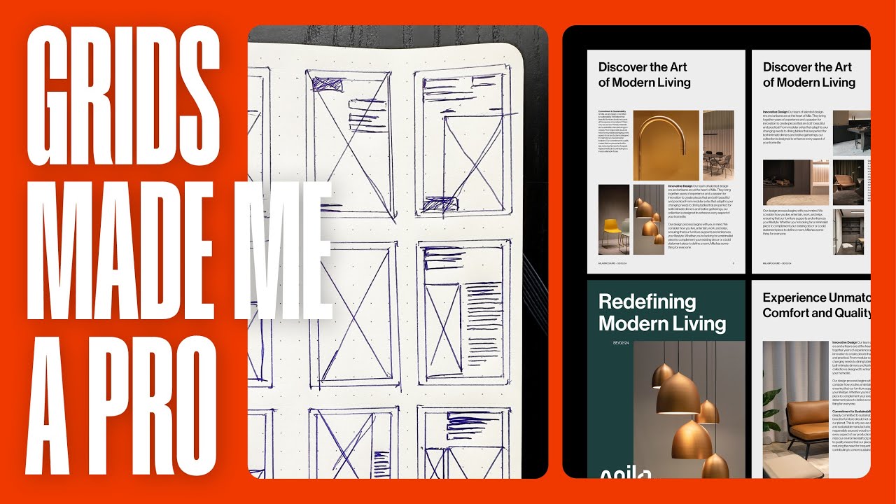


5.0 / 5 (0 votes)
